things change fast

Hello from quarantine!

since my partner had a bone marrow transplant, we are in isolation at home.

I’m going to post the last few tattoos I did before the state shut down businesses, then I’ll make a separate post of the art I’ve done while at home.

I miss you, clients. I miss you so much right now. This feels endless. We will get through it

FB_IMG_1586857290759FB_IMG_1586857224332

FB_IMG_1586857254050 FB_IMG_1586857264575 FB_IMG_1586857234103 FB_IMG_1586857243212 FB_IMG_1586857271755 FB_IMG_1586857279301

IMG_20200307_173116_532

IMG_20200312_203536_566 IMG_20200307_183809_529IMG_20200118_163640IMG_20200221_160050IMG_20200222_195254 IMG_20200313_201301_737 IMG_20200313_210937_426 IMG_20200308_144428_360 IMG_20200301_170031_343

high priestess, downtown eugene (so far)

High Priestess, Downtown Eugene, Oregon (so far):


13151386_1109393515770847_4557843067445571305_n

DSC_0494DSC_0493DSC_0488DSC_0492

13164280_10153663184182712_7526830988223341721_n
DSC_048613096222_10153663374702712_3202584005975852710_n13164414_10153663375447712_6243030030919681872_n

13178890_10153665259007712_479521409915805979_n13119010_10153665259287712_5059704762727019459_n

why that tattoo pain chart is meaningless.

I’m sure most of you have seen this image, or a similar one,  floating around the internet by now:
10557382_10152123344372126_495203462800773378_n

I’d like to point out that these images aren’t really telling you the whole story. As I’ve posted about before, several times, placement is only one of many variables that will make a tattoo hurt more or less. I’ll begin here just by saying- your frame of mind, your health, and your general attitude about the tattoo matter more than anything. Tattoos, generally speaking, don’t hurt very much. If you have had waxing done, if you’ve ever broken a bone, if you’ve ever had road rash or a bad cut…you’ve been through worse than a tattoo. You can do this. It’s on the level of…a beesting, a cat scratch, an annoyance.

But let’s take this chart for a minute, at face value- and just talk about areas where tattoos may hurt more or less.

The first thing to think about is your own personal sensitivities. Are you ticklish? Do you have previous injuries (even long-healed ones) in an area? Do feet freak you out? If you have any kind of area-specific thing going on in your mind or body, that’s going to affect how you feel while getting tattooed.

Then, there’s the idea that joints and areas with thin skin will hurt more. This isn’t necessarily the case. A tattoo on the side of the neck seems like it should be the worst thing ever, by these rules. Hell, in the image it’s a red zone! But in the image the center of the neck, the throat, is the red zone too- and those two areas feel very different. See, the only areas where you really have a big cluster of extra nerves are the

  • hands
  • face
  • genitals
  • solar plexus
  • throat
  • nipples

Everywhere else on your body is pretty much the same, as far as the sensitivity of the skin itself. Now some areas also have bone or underlying structures without much padding of muscle or fat. For some people, these areas are EASIER, for others, HARDER to get tattooed. It all depends on what kind of pain you dislike the most. If a deep throbbing or any kind f pressure just slays you, then areas without bony structures are going to hurt more- areas like

  • stomach
  • sides (below the ribs)
  • side of the neck
  • inner arm and armpit
  • inner thigh

if, for you, a stingy sensation is the worst thing, but you don’t mind pressure very much, you’re going to have a hard time with areas that have muscle right under the skin. Areas such as

  • lower back
  • top of shoulder
  • deltoid/front of arm
  • tops of thighs
  • calves
  • buttocks

Now if you don’t mind stingy feelings, and throbbing and pressure are no big deal, but you don’t like the feeling of papercuts or slices or the like, you may dislike bony areas the most. It seems to me that most people feel this way. This means that to at least some degree, the image has a few areas properly labeled for someone like that. The areas that would hurt would be:

  • ankles
  • hands/wrists
  • feet
  • collarbones
  • center of chest
  • shoulderblades
  • spine near center of back
  • ribs
  • kneecaps/elbows

Your body’s size and shape and composition matters too. If you have a lot of fat deposits, your hips may not be such a bad spot. But areas underneath rolls might hurt more, as they’re less exposed to sensation and touch in general. If you’re big and muscular, areas with tightly-stretched skin might hurt more- meaning a calf, one of the places the chart says is EASY, would be more painful to you. If you are scrawny and bony, areas with visible tendons may be the worst.

All of this talk of pain is so variable that you almost can’t pin it down and make any sort of universal chart.

Now let’s talk about where this dumb and inaccurate chart actually came from.


Something you can do, though, is make a chart showing areas that are the hardest for the artist to work on. This chart looks almost exactly like that “pain” chart, and versions of it used to be used in shops to show which areas would cost more than others for the same design. I have a sneaking suspicion that some client, at some point, saw this pricing chart and assumed we charged more for “hurty stuff”. This is not the case.

In fact, in some shops, the pricing system was worked out by square inch and placement, not by time. In the Before Times many shops would have all the available designs and flash up on the walls with prices attached. Nearby would be a chart exactly like the “pain” chart, saying, “areas in red cost $20 more, areas in blue $50 more” or something to that effect. This was not done because of how much those areas hurt the client- it was done because those areas are harder for us to tattoo.

acetate with square inches marked off.

acetate with square inches marked off.

So you lay that clear sheet with the inches marked on it, over the tattoo design. Any square containing ANYTHING counts. You have your minimum price, then you add however much per inch. So a shop with a $50 minimum, 20 per inch, a tattoo that is 2″ costs 90 bucks, base price for the easy-to-tattoo zones. Now you go to the chart. You want it on your wrist? Price goes up by ten bucks. You want it on your ribs? Price goes up by thirty bucks. And so on…This is one of the old ways of pricing tattoos, and strangely enough it often works out almost exactly what a tattoo would cost hourly. Those expensive areas just take longer so the time is extended anyway. Also, some areas are risky to us so they cost more.

If I am working on an area that is difficult to reach, my chance of a needle stick goes up. Slippery, sweaty areas are especially scary this way. If I’m working on an area where the skin shifts in response to ANY movement by the client (like ribs and center chest, for example) then I’m going to have to work harder to pull a straight line, to get things even and perfect. This extra work translated to extra pay, based on a chart like this one.

It had and has nothing to do with how you, the client, feel during the tattoo. The original of this color body chart is simply a  pricing guide for tattooers, not anything to do with what you will feel during a tattoo.


handy pricing chart used in some older studios.

handy pricing chart used in some older studios.

If I were to make a chart about the actual pain? I’d simply put a blank body form and have people print it out and color it in.
Put red any place where you are sensitive to tickling or have any kind of weird feeling about being touched. Also any place that folds over, where the skin touches itself and is rarely exposed to air or touch.
Put blue on your genitals, hands, and face- AND on any area that has a previous injury, even a healed one.
Put yellow on any place that is often exposed to touch and friction, that has a lot of exposure to air and sun.
Put green everywhere else.

This is your personal, very own pain chart. Everyone will have a different one. Unlike the tattoo artist’s perspective, where all armpits are pretty much the same to work on, the perspective as a client will be totally individual and unique.

Here’s a few stock images you can color in.

fat-slim-woman-white-background-30620793 Posture Template 1woman


Oh yeah- you’ve probably seen this garbage floating around as well. It’s crap, and it’s demeaning to you guys who are my clients, and I hate this kind of shit. Strangely enough I don’t have too many clients who pay no taxes or go to prison. There’s some slut-shaming in there too. What a load of crap.

tattoo-locations


(for a great article about pain and tattooing in general, my friend Deb wrote a great one here)
(for a chart to figure out how much of yourself is tattooed, you can look at matt gone’s awesome post about this here.)

a few older works. very older!

ukokprincessinformation_items_411

This first piece is based on tattoos found on a mummy, the Ukok ‘princess’ (probably a shaman). Her body is 2500 years old and was preserved in ice. Like the iceman of the Alps, these ancient human remains show intricate and amazing tattoo work, showing that our art has been around far longer than many might think.

Her body is about to be reinterred, which I think is a very good thing. We’ve learned a lot from her and need to return her to her resting place. You can read more about her here.
The woman who has these modern versions of the tattoos found on this ancient woman, is an anthropologist.

I think that all of the Ukok woman’s work is beautiful, and find the art very inspiring. I’ve seen actual full-scale images of these tattoos, and they are done impeccably. Even 2500 years ago, there were great tattoo artists in the world.
The work is astounding, compared to other tattoos we’ve seen from that era (which is not many). They’re not the typical bronze age/neolithic art we see, with its stick-figure base and straight lines, they’re ALIVE, in motion, vibrant. So inspiring.

The most recent MRI and other testing they did showed that she had advanced breast cancer, was using cannabis regularly (for the pain possibly) and had been thrown from a horse (which most likely is what killed her).

I really think that we’re not seeing all the things that were being done then. There’s almost…almost a thread that goes back, if you look at older tattoos (say, 1800s, or indigenous works) that makes me think our very earliest human ancestors were doing tattoos, and quite complex and intricate ones. Some motifs appear again and again, worldwide, and imply to me that there may be a previous, paleolithic art we’ll never get to see.

This woman’s tattoos hint at that even more strongly.

Feel free to share this post (or anything on my site, for that matter) or post any further information in the comments!

(more…)

The evolution of tattoo culture

tiger tattoo

tiger tattoo

To understand the current popularity of tattoo art in the US and Europe, it is important to know a little bit about its past.

Tattooing is one of the oldest art forms known to exist. The oldest preserved human skin ever found is decorated with tattoos that were done during life. It is used as a form of expression in the majority of the world’s cultures, and has been used for many purposes throughout history. In the last century in the West, it has been less common than in other parts of the world and in previous times. Recently, there has been a resurgence in its popularity.

(more…)

hobo how-to, makin an old-timey drawing

Here’s an old timey post for you guys. Tattoo artists that like old-timey stuff will recognize some of the in-jokes here that others might not- I kind of wrote it for you guys as a joke anyway, but these directions WILL work…so enjoy. You can actually buy prints of this guy here, YES PLEASE FUCKING BUY ONE I AM A FUCKING BROKE HOBO.

How to make an extremely old-timey picture

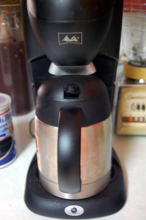
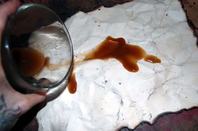
1.First, You have to brew coffee.

Good strong coffee.

The kind your grandpa would make at a hobo camp.

Coffee that will put hair on your chest.

Shit your sister would never drink.

The kind of coffee that people see in the glass and look confused about.

Brew your coffee first and brew it strong,

Not only will it keep you alert throughout this process, and taste better with whiskey in it,

but we’re going to use it as a dye.

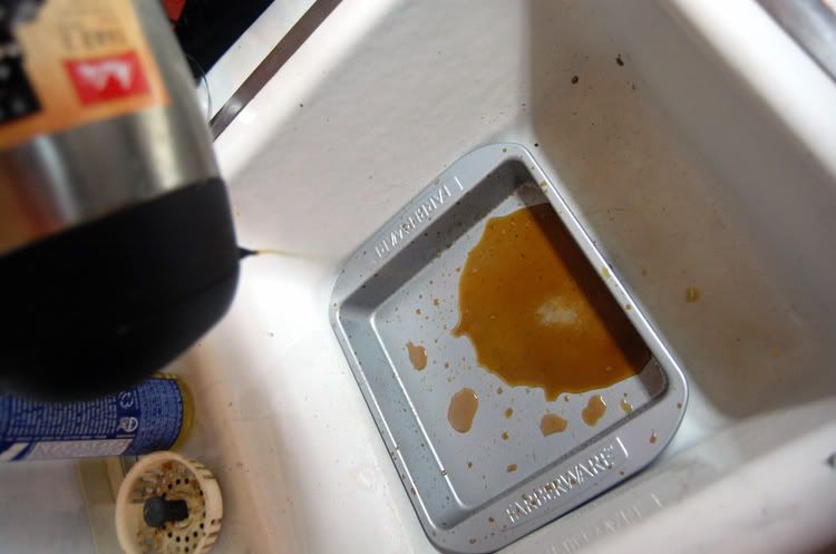
2. Then, pour into a tray. Soak some cardstock or watercolor paper in the coffee,
crumpling it and savaging it at random, if you are in a foul mood. or just soak it flat if you feel pretty amiable.

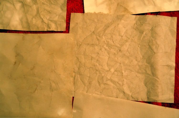
3.Lay the paper out on a towel or other handy surface, to dry out a bit. You want the paper to be just about totally dry when you start working with it. Not damp, just chilly. You’ll notice that the crumpled scapegoat paper looks kind of cool.

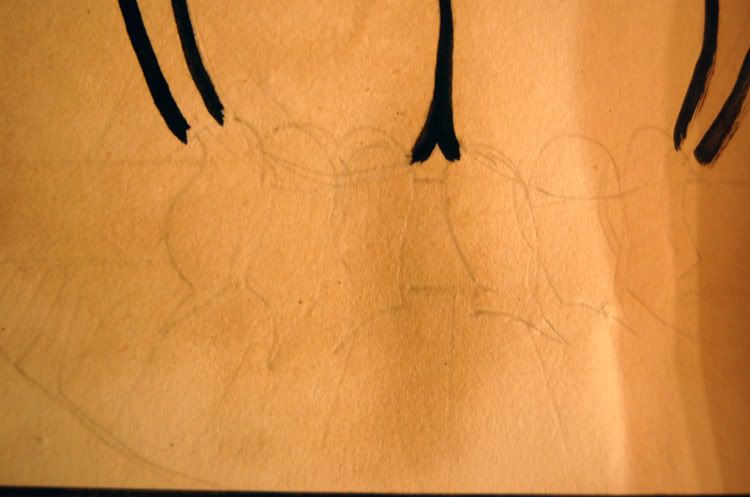
4.Next find yourself some reference, or using your brain and its own images, start drawing in light pencil on the paper. I used a 6h pencil so it would be very faint.

If you use a hard pencil don’t get too angry at the paper.

You’ll rip it to bits.

If you’re using a softer pencil go ahead and be a jerk to it.
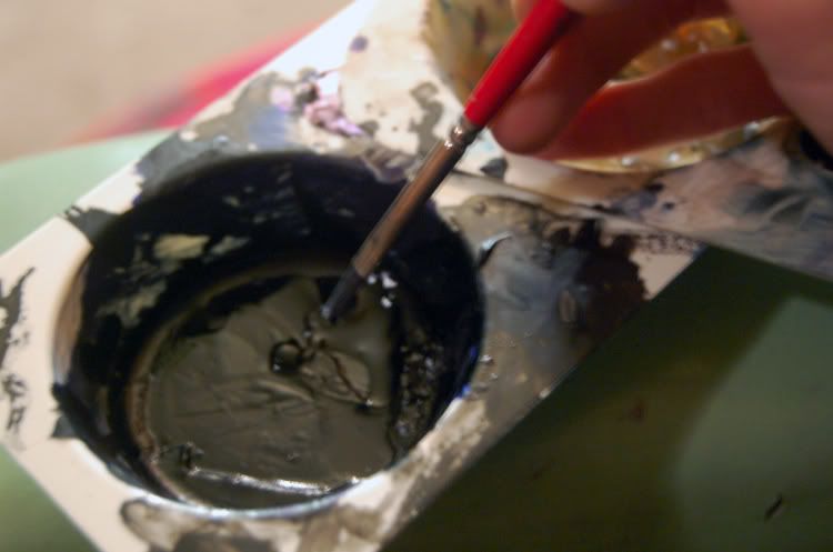
Then take a small soft filbert brush, dip it into black waterfproof ink, and draw some more.

Right over all the pencil marks.

I use either FW or higgins ink, for this.

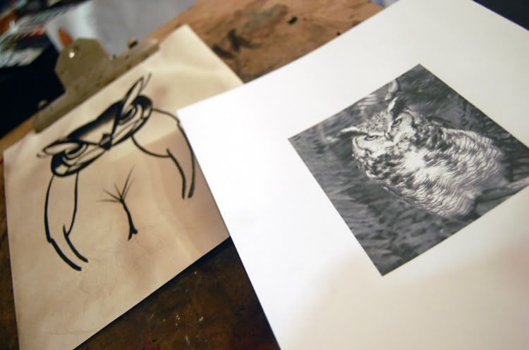
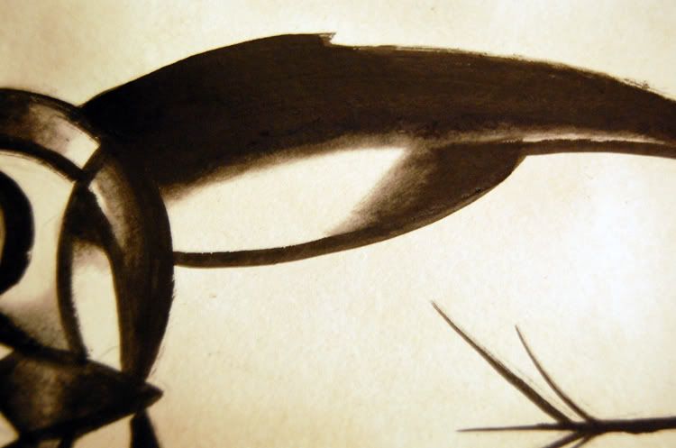
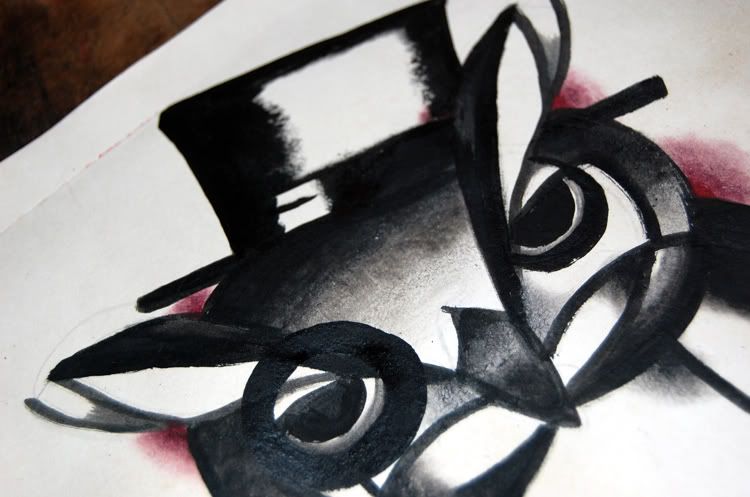
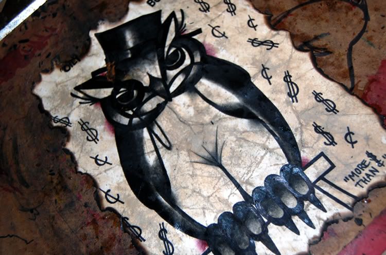
5.I have used reference for my hooter picture. Whatever you are drawing, remember that you only have a few minutes before the yard bulls show up and stick ya in the pokey, so hurry the fuck up.
Keep it extremely simple.

6.I mean real simple. You can use watercolor black from the tube. Or you can use some liquid watercolors.

Or you can use kid’s paint, dry watercolors, although those are a pain in the ass. I suppose you can also use sharpie or prismacolor with alcohol on the brush, too, but those dry really fast, too fast for me to do old timey stuff with them. They do have the benefit of using up your whiskey spit.

Here is my ink and brush- as you can see, my brush is flattened and curly? That’s because I’m too lazy to clean them up right away, so they sit in the water til they dry out weird and curly. Don’t do that.

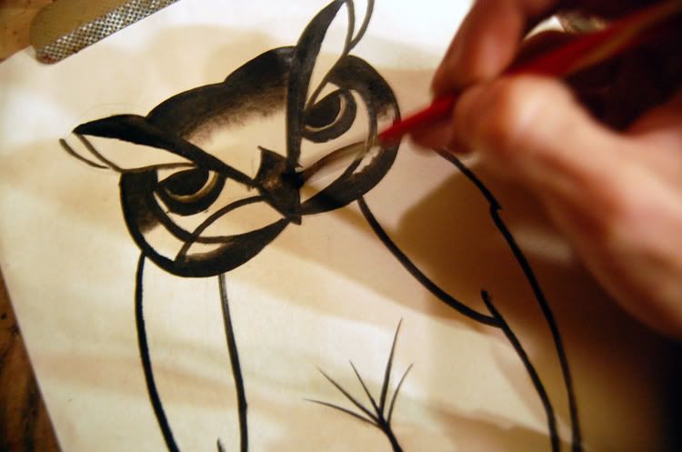
7.I usually lay in the darkest areas first, then come back through with a dry brush and smooth out the edges, then with a only very slightly damp brush I moisten the edges of that again, making it blend. it doesn’t take long and you don’t need water- it’s easier to use a damp sweaty hand or your spit to do it. if you are drinking your coffee like you should be then your hands will be nice and sweaty by now. I know a lot of people will have the unbearable urge to wet the paper then paint onto it, like you’re supposed to use watercolors.

WE’RE NOT DOING THINGS THAT WAY IN HERE, GO BACK TO WETCANVAS FORUMS.

8.At this point, just crank up the music and keep going. you wanna
keep it minimal.

Suggested music would include baby gramps, tom waits (early works, or like bone-machine)
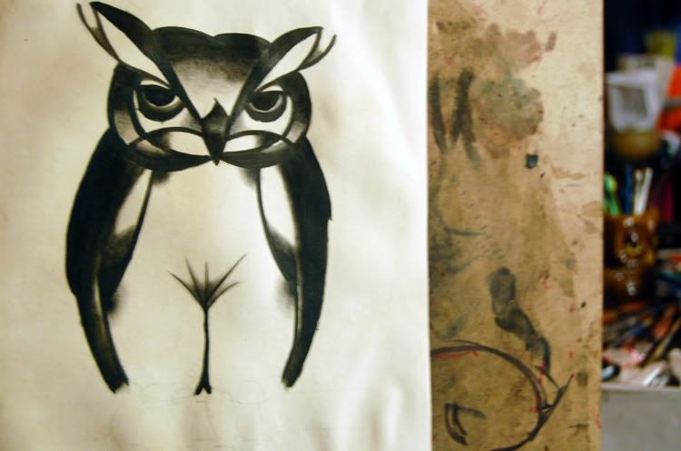
I actually think I did way too much on this one, way more shading and fucking around than I should have.

The simpler, the smoother, the less work, the better with this stuff.

If you mess up somewhere, just find a way to hide it with more black.

That’s what it’s there for, right? I guess if I was truly old timey I’d be using lampblack soot, dirt, and saliva  to make the picture.

I try to get pretty close, anyway.

Eventually, you will come to believe you are finished, or the yard goat’s light will pick you out, and you’ll have to stop with the feverish sweating and blending.

9.Now, since you’ve come so far, finish out any little things you got confused about,or forgot to do, while you were blending.

Like his fucking feet and the perch.

Everything will probably look a little rough and shitty at this point. It helps when doing this kind of artwork to make sure your lighting is inadequate, and that you have someone sitting near you drinking and exclaiming at random intervals,
and that you work on a shitty piece of uneven wood, or at least a stained old clipboard precariously balanced
on your knees.

Markers are only considered cheating if you do them with your right hand.
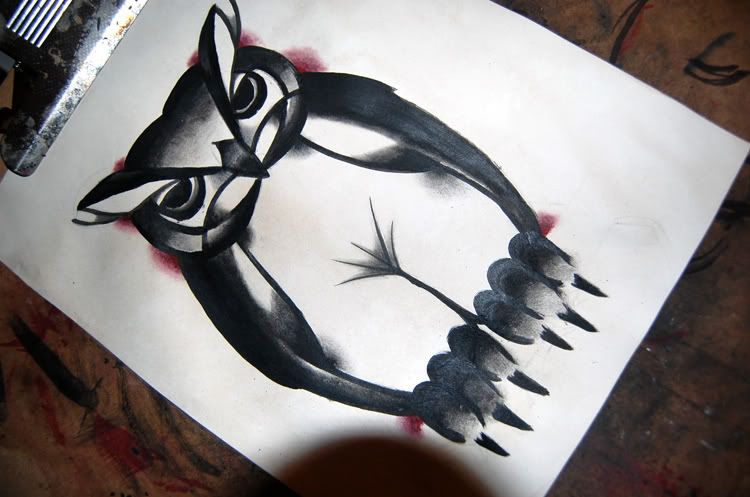
roughed out

10.Now if you want to be schmancy, you can pick a few spots and put a color in it. One color. What do you think this is, art school?
One color only. Remember, you’re a bindlestiff, a wayfarer, a gandy…you ain’t got no room for paint pots in that sack, kiddo. One color. It’s not even 1940 yet, so simmer down.

I like to use red everytime. Feel free to use green, yellow, or brown if you prefer.

No blue, no purple, definitely no hot pink- you’re in the wrong place to get fancy.

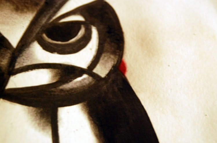
Put a dot where you think the darkest red should be.

11.Do this for every place red will go.Then use the almost all the way-dry brush you’ve been chewing on, to blend them out. I like to make the areas of color into little half-circles.

12.Wow, that’s come along pretty far. Looks nice and clean. At this point I usually would put on a monocle and top hat.

No matter what you are drawing, just go ahead and do it,
trust me, monocle and top hat.

Man, if you can give it a cigarette in a long holder, even better.

The closer you get to the monopoly guy, the better.

You want the art to be classy, goddamnit.

If you can’t do a monocle and top hat, whatever you do, DON’T ADD A MUSTACHE-

This is old timey, not HIP.

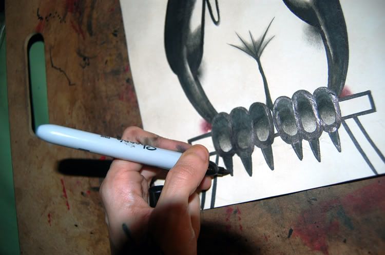
13.At this point, get out a thin liner brush, or a permanent black non-water soluble marker,and clean up the edges of the black and all the lines.

Now if you want to be a dick you can add a bunch of crap around it. This one looks like a capitalist pig owl to me, so I’m giving him a name and a joke.

It’s a shitty joke, I know.

No really. I know.

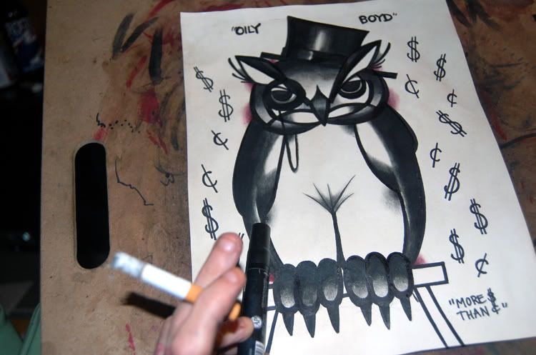
You will be tempted to draw blood, or if you are a tattoo”er” some raindrops, around the object. Resist this temptation!!!
Your picture should be a combination of items that is humorous to you, and you alone.

that means no unicorns, no mustaches, no ironic shit.

Nothing that popular modern culture would enjoy

(says the one painting an owl in a top hat)

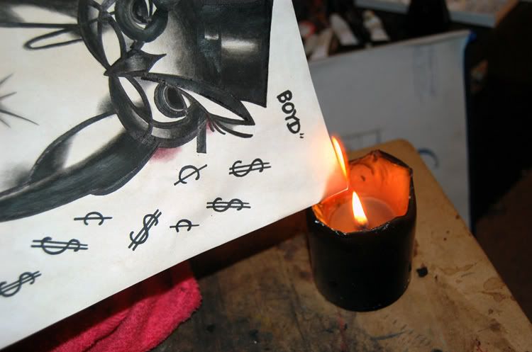
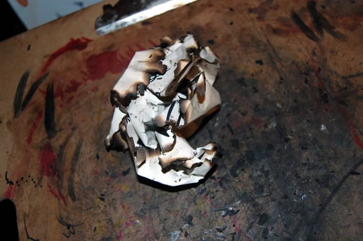
14.Now get a damp, really damp rag, and a candle, and set that shit on fire!

15.The rag is for putting out the fire, so that you only burn the parts
of your page that seem useless to you, or where it would look cool to have a singe.

You need the rag.

I should make it very clear that if you’re kind of half-assedly following the instructions and didn’t bother to get a damp rag you might be kind of fucked right now,

because you set your shiny new art on fire.

That’ll teach you to follow instructions.

16.Bet you like it so far, huh?
Think you did a good job?
That’s some kinda cool picture?

BULLSHIT, IT’S GARBAGE!
THROW IT THE FUCK AWAY!
YOU SAD SACK OF SHIT,
YOU CAN’T DRAW!!!

UGH SERIOUSLY YOU SUCK!

JUST CRUMPLE THAT WASTE OF TIME INTO A BALL AND THROW IT AT A POKEY OR A COP!

IT’S NO GOOD FOR ANYTHING ELSE!

Damn, I was just kidding!
Sheesh, man, try to have a thicker skin!
Why you gotta be so worried
about what I think, anyway? flatten that
thing out again, let me get a closer look.

Go easy on it. I mean it’s still kind of-

oops oh shit hey I’m sorry-

Hey waittaminute…ok

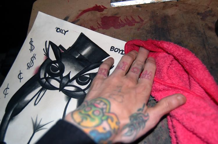
dry that crap off with the rag. the burny rag.

You really needed that rag.

17. Crumple it up, flatten it out,
spill coffee all over the back of it,
and let it soak for a few. Don’t do this
until ALL the paint has dried completely.
That looks right out of a hobo museum.

Good show, sir, good show.

Originally Published on: Nov 12, 2007

Innawoods pictures, 8/13.

The end-of-summer trip.

car

car vape

bow

backwoods handicrafts. grass tiedown.

(more…)

“dwelling portably, formerly known as Message Post, Sept, 2001-2005”

Printed originally in “dwelling portably, formerly known as Message Post, Sept, 2001-2005”

A tightly-printed little stapled zine, Dwelling Portably was printed in Philomath OR. I have three or four issues of it, and it would be almost two novels’ worth of typing to get them posted online in their entirety. This zine is CRAMMED with text, tiny tiny text. I’ll try to get the more interesting snippets up.

“”about Chaz’s hobo castle and Ozark land,

I don’t recommend building around campers. Building around something is much more difficult, and the result is not a new building because this old thing is in there. Better to start from scratch and, if you do a good job, you will have something worthwhile when you’re done. If I was doing it again, I would build a straw-bale house.

I now have a far better toilet system, inspired by Joe Jenkins’ Humanure Handbook. I now cover with sawdust, then compost. If done properly, the heat will kill all pathogens, and, in two years, I’ll be able to use the compost directly on my garden. Eastwind Community has successfully used this system for several years, and fertilize their extensive organic gardens. I helped collect one day.

(more…)

Jim Thorpe, and the march of time

This used to be the most awesome crawlupon ruin in the county- just beautiful and so interesting. Well, now they’ve fenced it off. No trespassing-so they can renovate it…for the tourists.

I am currently a tourist.

I would NOT pay to see this rebuilt. It’s just not interesting at all renovated. The beauty of these ruins is in the freedom to roam them, to go where you want and see the decay of the stone…a tour guide? Pfft. Why bother?

I mean- I may be out of line but, I prefer to lay my hands on history, gently. Not see it from ten feet away…also, rebuilding a site which is famous and amazing because it is ruined and abandoned? that’s just stupid.

I am probably wrong in my feelings about this subject but restoration of abandoned places irks me. I like the decay and abandonment. I like it. I don’t want them to rebuild it and repaint it and put some lady in a period costume in there for minimum wage to explain crap to me. That’s just me.

There are still abandoned places here and everywhere- let’s hope they are allowed to rest in peace instead of being dolled up and paraded around for money.

rain on dark city streets

terrible dreadlockssmoking girlWhen I was much, much younger I lived in a second-floor apartment across from a gay bookstore in Philadelphia for a while. (Thanks to them for introducing me to Hothead Paisan at such an impressionable age, by the way.)  It was a decent apartment, with a nice fireplace. We had several cats, my girlfriend and I. I owned an ancient underwood typewriter, which I place on a board in the window, I drank a lot of coffee and smoked way too much. And on rainy spring nights I’d sit in the window watching the people go in and out of the bookstore, and I’d try to write…poetry. This was before tattooing, before the west coast, before the zine, before I squatted, before I dropped out of civilization for the wild years. This was the start of that. It was the BEFORE TIMES.

It was horrible, in retrospect. But at the time I felt like it was a way to recognize that inside me hides an angry intellectual snob, someone who could rise above living in shitsville, who’d worked in factories. Some kind of Henry Miller/Bukowski/Hemingway persona. Some kind of talent that made me better than what I’d come from. I hadn’t started working at art in earnest yet, collage and a few drawings or paintings were all I’d done, so writing seemed a natural outlet for me instead.

(more…)

Older »

This is a unique website which will require a more modern browser to work!

Please upgrade today!