so, you want a lot of words in your tattoo.

19505_10152948236462712_9141122821601630296_nTattoos of lettering are classic, of course. There’s nothing wrong with getting words tattooed on you. Sometimes, though, you can overdo it.

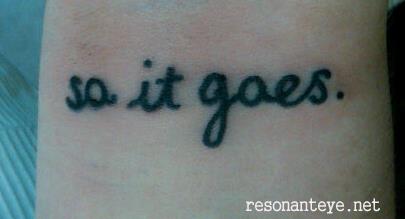
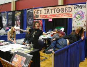
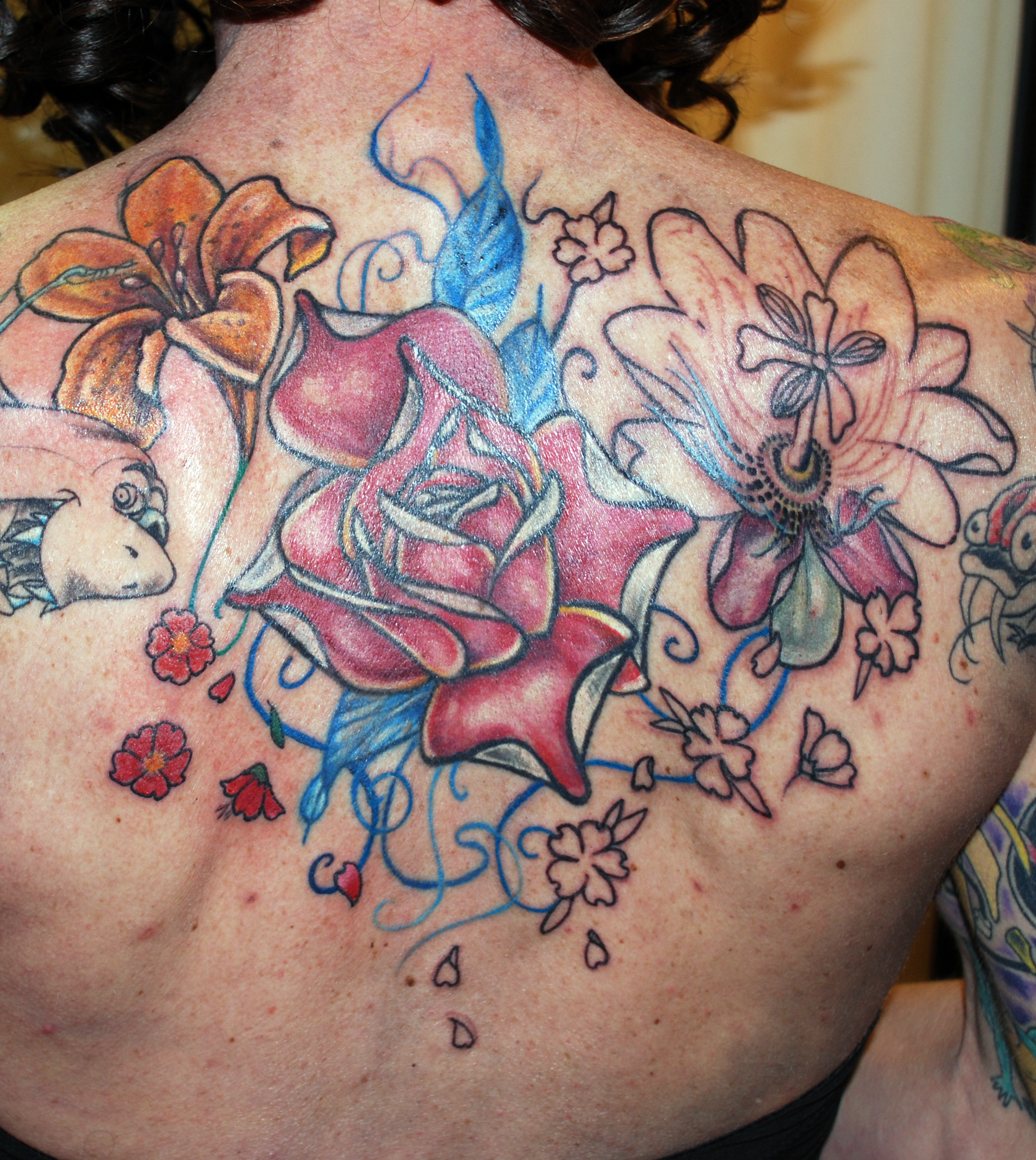
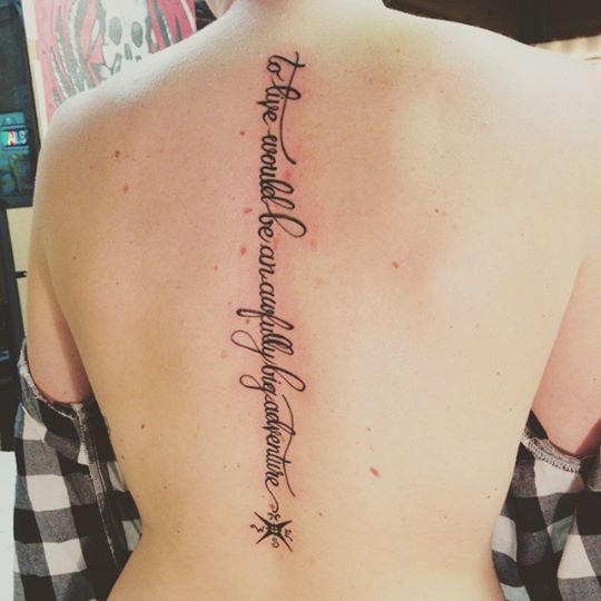
(This woman did not overdo it.)


For example, let’s say there’s a poem you really like. It’s four lines long. It goes like this:

Brave men who work while others sleep,
Who dare while others fly…
They build a nation’s pillars deep
And lift them to the sky.
(Emerson)

Or, another example:

The woods are lovely, dark, and deep,
But I have promises to keep,
And miles to go before I sleep,
And miles to go before I sleep.
(Frost)

20090929-tolkien

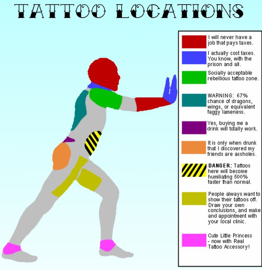
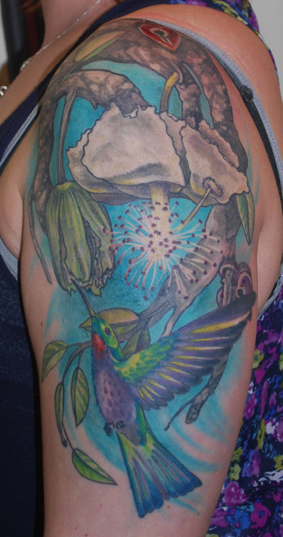
sometimes you really do want to dedicate a lot of skin to words. that’s ok, too, but only if it’s a flatter area where curving muscle won’t impede the reading of it.

These are lovely sentiments. On skin, however, with the limitations due to cellular changes over time, they wil end up being about ten inches across and six inches tall. That’s a HUGE area dedicated to text alone. Let’s say you want a tattoo of a hammer and some clouds, with that Emerson poem. Or you want some trees and a path, with that Frost quotation. What’s going to happen is the text is going to completely overwhelm the imagery, and dilute it.

Tattooing is a visual medium. The whole point of a symbolic tattoo is to take a concept (words) and use the tattoo (image) to express it. Adding lines and lines of text to an image….it’s a bit redundant. Like getting a tattoo of a bird with the word “BIRD” on it- unnecessary and really odd to look at, in the end.


You have choices here, of course.

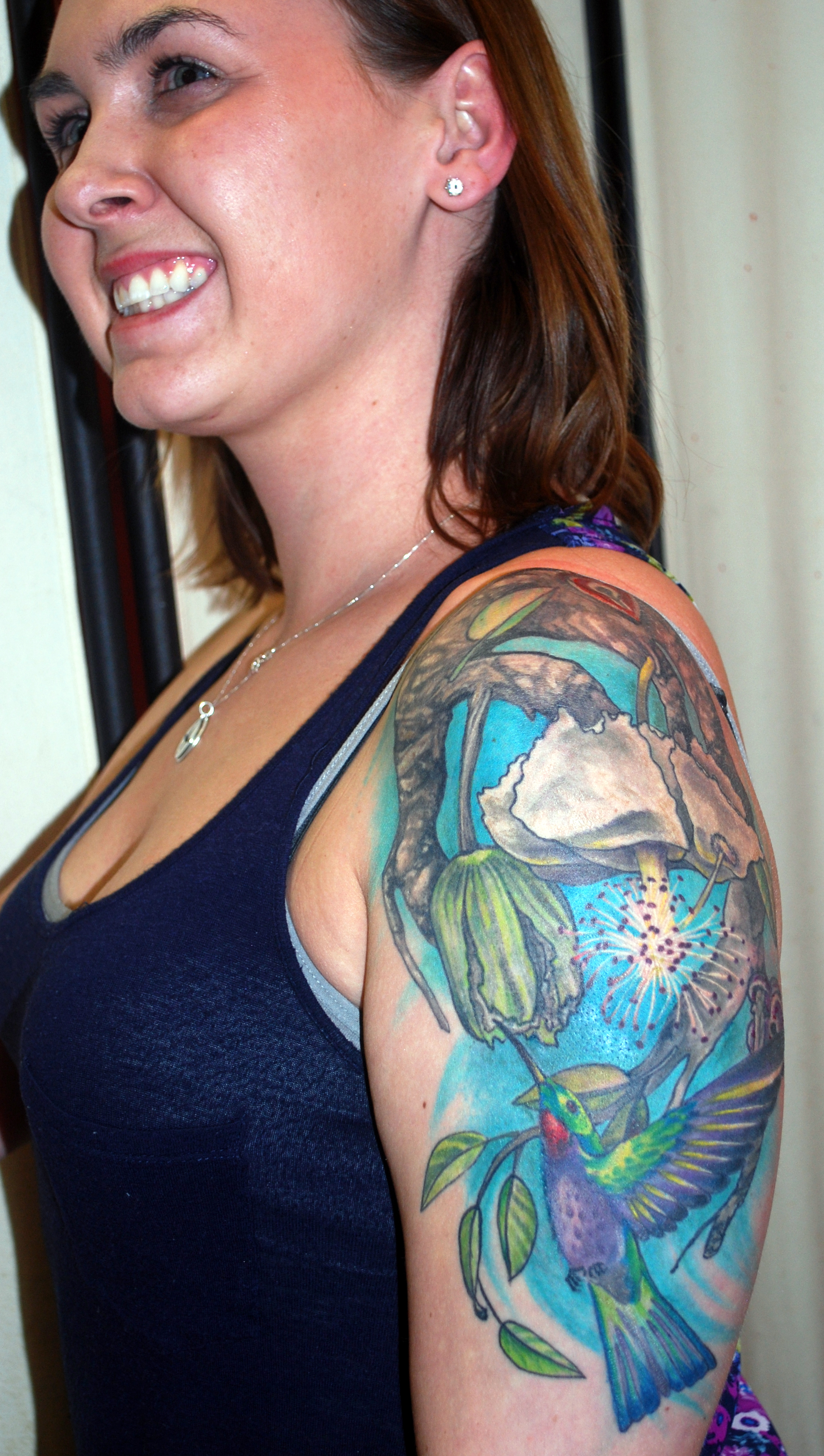
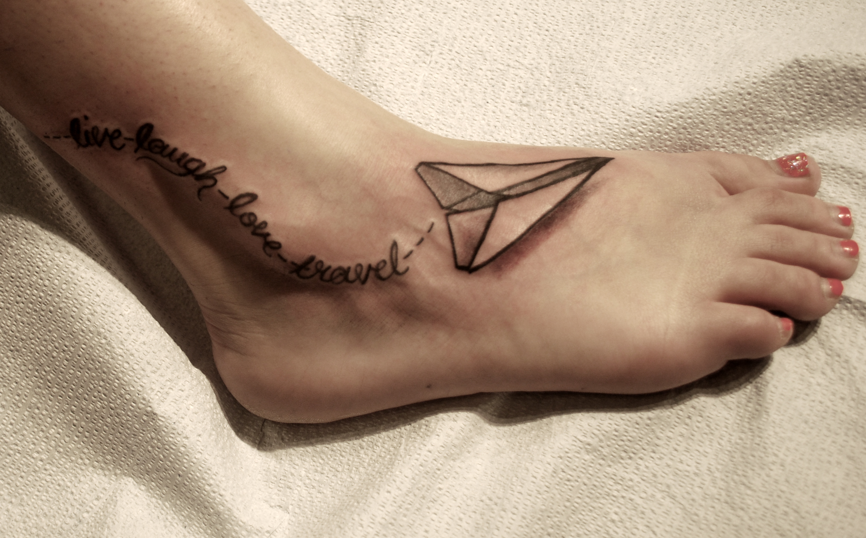
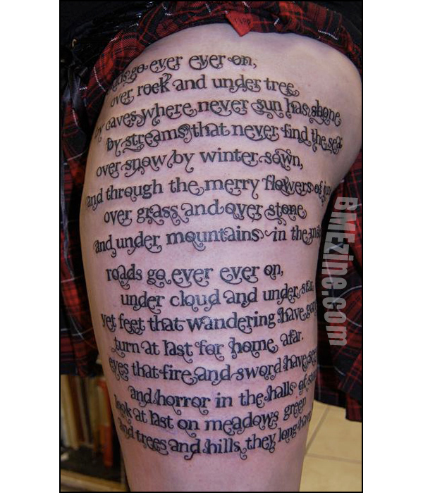
  • You can opt to get just the lettering, the text itself, alone. Well-done, large-enough text by itself is just fine. It will be bigger than you think, but it can look great. This is a good choice if the writing is from a friend or family member, a case in which the meaning of the words matters less than the exact words themselves. Or if you don’t want any images associated with the meaning on you, at all. In the first tattoo posted above, the client didn’t actually want Peter Pan or anything on her; she simply liked the text itself. Same with the Hobbit poem.
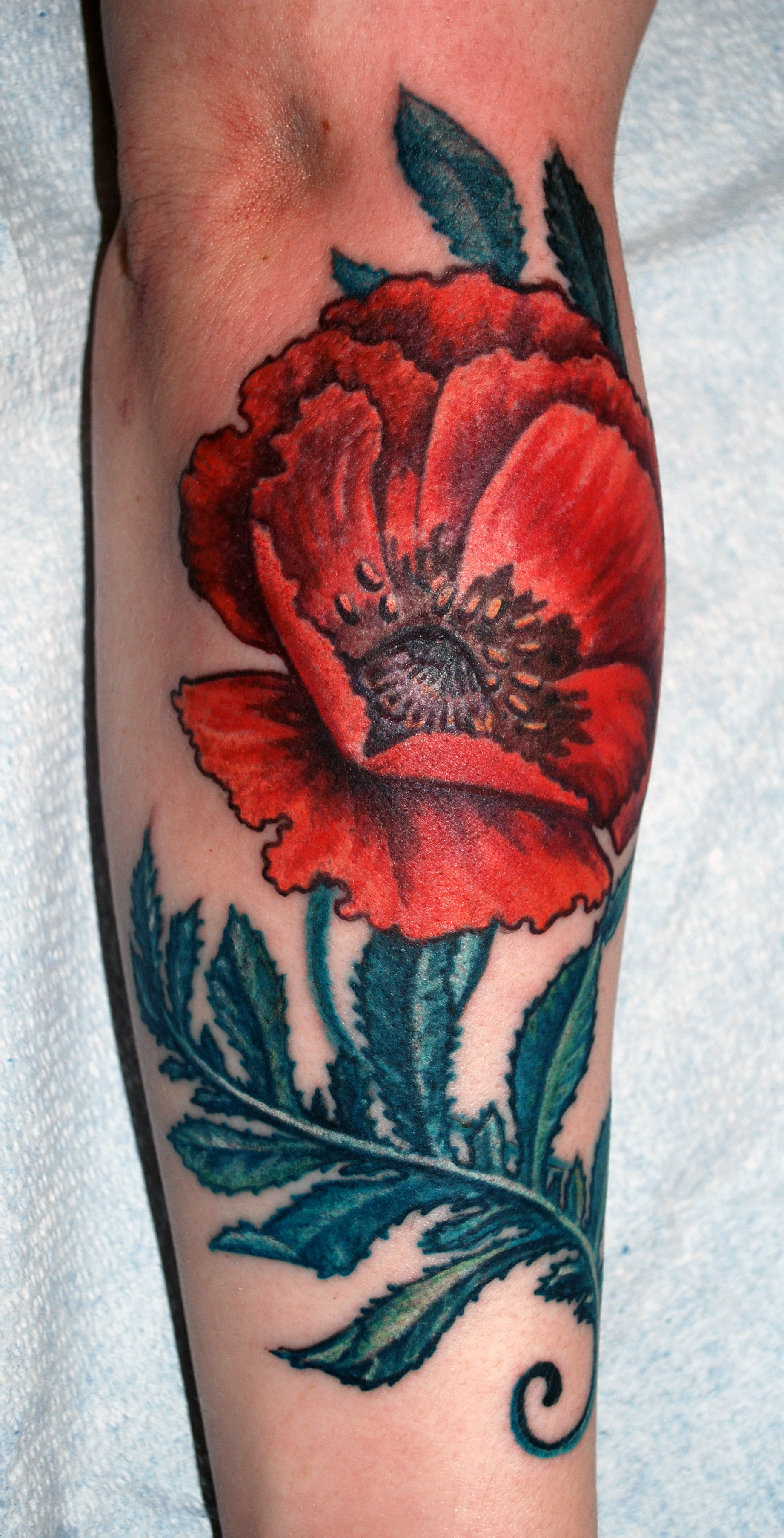
  • You can get just an image that sums up and represents the text. For the Frost poem, a landscape of snowy woods, or a waiting horse next to some trees, would be pretty accurate to the poetry. Done in a bleak color scheme it would represent the sentiment of the poetry really well, too. This is really the best choice if the poem is well-known, or if it’s just the feeling and meaning of the poetry that you love so much.
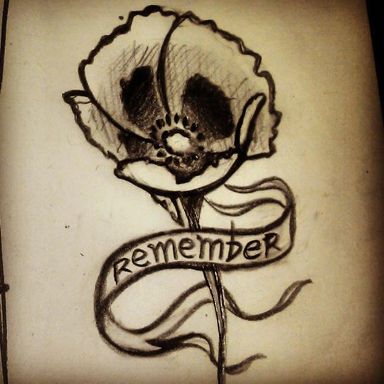
  • A third option is to narrow down the words you’ll add. For the Emerson poem, you could do a hammer and clouds with the words “Work, Courage” or something similar. Or use only one line of the poem, “Dare while others fly” as part of the design. (In a banner, or similar.) This gives you a bit of the poetry without losing the impact of the imagery as much. “miles to go before I sleep”, done in pale text, below a line of trees…that would be a good solution to using the Frost poem as a tattoo inspiration.
cyuvjkhb

this poem, in full, would have taken up her entire side, leaving no room for the drawing of a woman representing her mother. (the poem in its entirety is on her mother’s headstone.)

I usually suggest to my wordy clients that they go with the third option- I love poetry and books, and think that a snippet of text in a tattoo can actually add to its impact. It also serves as a reminder to the person of the entire written piece. I usually limit the amount of text to about five words, maximum, if there’s any images being tattooed along with it.

If someone wants a very, very long quotation I will do it- but I usually suggest treating the text block as an abstract shape, making it curve to fit the body area being tattooed. It helps a little, and allows you to get neighboring tattoos later in life without too much fuss. Having a lot of straight lines on a floating block can really limit your future options.

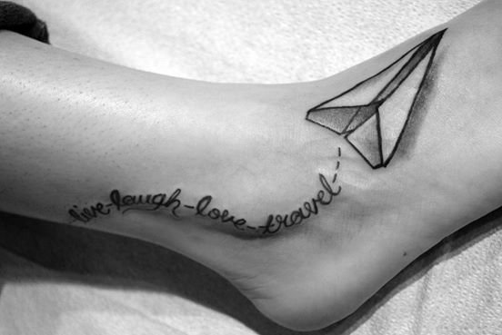
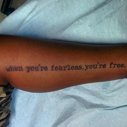
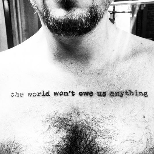
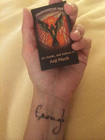
If you want one word or short phrase, though, it’s easy. We can treat the text itself as an image, and make it fit. Simple lettering is really fun, playing with text forms is enjoyable and placement becomes a breeze. You can be selective in your quotation and still carry the meaning of the entire text pretty well.
484549_10150946470712712_918239467_n 10348177_10152755130172712_2294689037192137295_n 11951279_10153168436387712_1654153991962033826_n (1) 11193385_10152897009782712_6589332615625688878_n 10525604_10152519297487712_4587482466235956454_n

10622905_10152347342202712_6876650520959949575_n (1)

tattoos from august in seattle!

11813479_10153112367482712_2592867061263074714_n

sketches

11822813_10153122756642712_3172683504122543674_n

in progress

11863475_10153124325267712_5367954348815247798_n

sketches

11873500_10153124967942712_33611054242400851_n

side one

11846663_10153124969582712_3502397861926547379_n

side two

11811287_10153120454812712_7652708123041968894_n

life finds a way


schedule updates winter 2015/16

In the permanent collection of the Museum of Unfine Art, Eugene, Oregon

UPCOMING SCHEDULE AND EVENTS:

New Horrors coloring book release, available here. Signings and coloring party coming soon!

Totem animals will be hanging for sale- handpainted giclee prints, at Vittles, 2320 2nd Ave Seattle (Belltown)- all through December!

Art show, “Future History”, at Club Tattoo in Scottsdale AZ feb. 21!

Eugene, Oregon, at High Priestess downtown- postponed– march 7-14

Seattle, at Laughing Buddha, postponed– march 12-20

Evergreen Tattoo Convention, in Springfield Oregon, March 4-6

Botanical art show, ‘Rights to Spring’,  at Americana, Seattle, April 2016.

One Nation Under Ink Convention, in Shelton WA, April 8-10

Guest spot at Abaddon Tattoo, PA, August 17-24.

Possible conventions: Seattle (august?) and Vegas (fall?).

To schedule time in Seattle, please contact the shop:
Laughing Buddha Tattoo and Body Piercing,
t
o schedule time at High Priestess, in PA, or at conventions, use this link: http://resonanteye.net/consultation-process-starts-here/


dsc_0521

I’m not taking art commission requests at this time, but you can still find prints at this link, and originals listed in the shop here (link up top in the menu).

why that tattoo pain chart is meaningless.

I’m sure most of you have seen this image, or a similar one,  floating around the internet by now:
10557382_10152123344372126_495203462800773378_n

I’d like to point out that these images aren’t really telling you the whole story. As I’ve posted about before, several times, placement is only one of many variables that will make a tattoo hurt more or less. I’ll begin here just by saying- your frame of mind, your health, and your general attitude about the tattoo matter more than anything. Tattoos, generally speaking, don’t hurt very much. If you have had waxing done, if you’ve ever broken a bone, if you’ve ever had road rash or a bad cut…you’ve been through worse than a tattoo. You can do this. It’s on the level of…a beesting, a cat scratch, an annoyance.

But let’s take this chart for a minute, at face value- and just talk about areas where tattoos may hurt more or less.

The first thing to think about is your own personal sensitivities. Are you ticklish? Do you have previous injuries (even long-healed ones) in an area? Do feet freak you out? If you have any kind of area-specific thing going on in your mind or body, that’s going to affect how you feel while getting tattooed.

Then, there’s the idea that joints and areas with thin skin will hurt more. This isn’t necessarily the case. A tattoo on the side of the neck seems like it should be the worst thing ever, by these rules. Hell, in the image it’s a red zone! But in the image the center of the neck, the throat, is the red zone too- and those two areas feel very different. See, the only areas where you really have a big cluster of extra nerves are the

  • hands
  • face
  • genitals
  • solar plexus
  • throat
  • nipples

Everywhere else on your body is pretty much the same, as far as the sensitivity of the skin itself. Now some areas also have bone or underlying structures without much padding of muscle or fat. For some people, these areas are EASIER, for others, HARDER to get tattooed. It all depends on what kind of pain you dislike the most. If a deep throbbing or any kind f pressure just slays you, then areas without bony structures are going to hurt more- areas like

  • stomach
  • sides (below the ribs)
  • side of the neck
  • inner arm and armpit
  • inner thigh

if, for you, a stingy sensation is the worst thing, but you don’t mind pressure very much, you’re going to have a hard time with areas that have muscle right under the skin. Areas such as

  • lower back
  • top of shoulder
  • deltoid/front of arm
  • tops of thighs
  • calves
  • buttocks

Now if you don’t mind stingy feelings, and throbbing and pressure are no big deal, but you don’t like the feeling of papercuts or slices or the like, you may dislike bony areas the most. It seems to me that most people feel this way. This means that to at least some degree, the image has a few areas properly labeled for someone like that. The areas that would hurt would be:

  • ankles
  • hands/wrists
  • feet
  • collarbones
  • center of chest
  • shoulderblades
  • spine near center of back
  • ribs
  • kneecaps/elbows

Your body’s size and shape and composition matters too. If you have a lot of fat deposits, your hips may not be such a bad spot. But areas underneath rolls might hurt more, as they’re less exposed to sensation and touch in general. If you’re big and muscular, areas with tightly-stretched skin might hurt more- meaning a calf, one of the places the chart says is EASY, would be more painful to you. If you are scrawny and bony, areas with visible tendons may be the worst.

All of this talk of pain is so variable that you almost can’t pin it down and make any sort of universal chart.

Now let’s talk about where this dumb and inaccurate chart actually came from.


Something you can do, though, is make a chart showing areas that are the hardest for the artist to work on. This chart looks almost exactly like that “pain” chart, and versions of it used to be used in shops to show which areas would cost more than others for the same design. I have a sneaking suspicion that some client, at some point, saw this pricing chart and assumed we charged more for “hurty stuff”. This is not the case.

In fact, in some shops, the pricing system was worked out by square inch and placement, not by time. In the Before Times many shops would have all the available designs and flash up on the walls with prices attached. Nearby would be a chart exactly like the “pain” chart, saying, “areas in red cost $20 more, areas in blue $50 more” or something to that effect. This was not done because of how much those areas hurt the client- it was done because those areas are harder for us to tattoo.

acetate with square inches marked off.

acetate with square inches marked off.

So you lay that clear sheet with the inches marked on it, over the tattoo design. Any square containing ANYTHING counts. You have your minimum price, then you add however much per inch. So a shop with a $50 minimum, 20 per inch, a tattoo that is 2″ costs 90 bucks, base price for the easy-to-tattoo zones. Now you go to the chart. You want it on your wrist? Price goes up by ten bucks. You want it on your ribs? Price goes up by thirty bucks. And so on…This is one of the old ways of pricing tattoos, and strangely enough it often works out almost exactly what a tattoo would cost hourly. Those expensive areas just take longer so the time is extended anyway. Also, some areas are risky to us so they cost more.

If I am working on an area that is difficult to reach, my chance of a needle stick goes up. Slippery, sweaty areas are especially scary this way. If I’m working on an area where the skin shifts in response to ANY movement by the client (like ribs and center chest, for example) then I’m going to have to work harder to pull a straight line, to get things even and perfect. This extra work translated to extra pay, based on a chart like this one.

It had and has nothing to do with how you, the client, feel during the tattoo. The original of this color body chart is simply a  pricing guide for tattooers, not anything to do with what you will feel during a tattoo.


handy pricing chart used in some older studios.

handy pricing chart used in some older studios.

If I were to make a chart about the actual pain? I’d simply put a blank body form and have people print it out and color it in.
Put red any place where you are sensitive to tickling or have any kind of weird feeling about being touched. Also any place that folds over, where the skin touches itself and is rarely exposed to air or touch.
Put blue on your genitals, hands, and face- AND on any area that has a previous injury, even a healed one.
Put yellow on any place that is often exposed to touch and friction, that has a lot of exposure to air and sun.
Put green everywhere else.

This is your personal, very own pain chart. Everyone will have a different one. Unlike the tattoo artist’s perspective, where all armpits are pretty much the same to work on, the perspective as a client will be totally individual and unique.

Here’s a few stock images you can color in.

fat-slim-woman-white-background-30620793 Posture Template 1woman


Oh yeah- you’ve probably seen this garbage floating around as well. It’s crap, and it’s demeaning to you guys who are my clients, and I hate this kind of shit. Strangely enough I don’t have too many clients who pay no taxes or go to prison. There’s some slut-shaming in there too. What a load of crap.

tattoo-locations


(for a great article about pain and tattooing in general, my friend Deb wrote a great one here)
(for a chart to figure out how much of yourself is tattooed, you can look at matt gone’s awesome post about this here.)

day one- evergreen tattoo convention.

DSC_0053

(more…)

finished massive flash sheets, ear weights from this month.

22x30" sheet of flash for tattoos, I did this to bring to the evergreen convention.

22×30″ sheet of flash for tattoos, I did this to bring to the evergreen convention.

22x30" sheet of flash for tattoos, I did this to bring to the evergreen convention.

22×30″ sheet of flash for tattoos, I did this to bring to the evergreen convention.

new set, these are for sale at laughing buddha in seattle. 7/16" saba wood with oak and nut dangling on silk wrapping.

new set, these are for sale at laughing buddha in seattle. 7/16″ saba wood with oak and nut dangling on silk wrapping.

set I'm working on- 1/2" saba wood with glass, oak, and maple beads, silk threadwrapping, and copper-wrapped hand polished agates.

set I’m working on- 1/2″ saba wood with glass, oak, and maple beads, silk threadwrapping, and copper-wrapped hand polished agates.

floral piece in progress

DSC_0490

work in progress. This is our second sitting on these flowers! And no, I didn’t do the sharknado, sadly enough.

paper planes, baobabs, and poppy dreams.

DSC_0034

healed.

DSC_0033

detail

DSC_0010

SO. MUCH. FUN.

DSC_0022

fun stuff!


a repair, and a sun.

repair- during process, and after.

repair- during process, and after.

black and grey and white

black and grey and white

peacocking.

DSC_0470

« Newer -- Older »

This is a unique website which will require a more modern browser to work!

Please upgrade today!