I’m sure most of you have seen this image, or a similar one, floating around the internet by now:
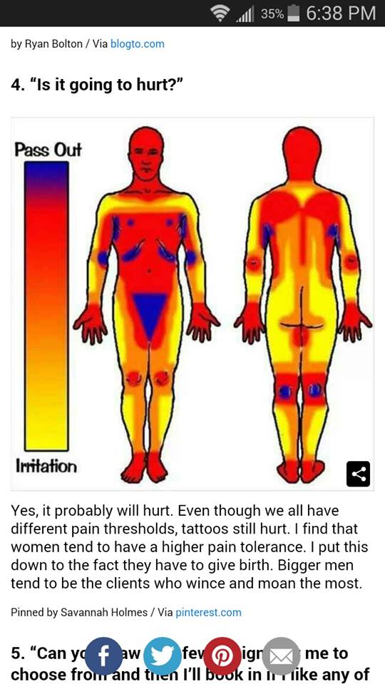
I’d like to point out that these images aren’t really telling you the whole story. As I’ve posted about before, several times, placement is only one of many variables that will make a tattoo hurt more or less. I’ll begin here just by saying- your frame of mind, your health, and your general attitude about the tattoo matter more than anything. Tattoos, generally speaking, don’t hurt very much. If you have had waxing done, if you’ve ever broken a bone, if you’ve ever had road rash or a bad cut…you’ve been through worse than a tattoo. You can do this. It’s on the level of…a beesting, a cat scratch, an annoyance.
But let’s take this chart for a minute, at face value- and just talk about areas where tattoos may hurt more or less.
The first thing to think about is your own personal sensitivities. Are you ticklish? Do you have previous injuries (even long-healed ones) in an area? Do feet freak you out? If you have any kind of area-specific thing going on in your mind or body, that’s going to affect how you feel while getting tattooed.
Then, there’s the idea that joints and areas with thin skin will hurt more. This isn’t necessarily the case. A tattoo on the side of the neck seems like it should be the worst thing ever, by these rules. Hell, in the image it’s a red zone! But in the image the center of the neck, the throat, is the red zone too- and those two areas feel very different. See, the only areas where you really have a big cluster of extra nerves are the
- hands
- face
- genitals
- solar plexus
- throat
- nipples
Everywhere else on your body is pretty much the same, as far as the sensitivity of the skin itself. Now some areas also have bone or underlying structures without much padding of muscle or fat. For some people, these areas are EASIER, for others, HARDER to get tattooed. It all depends on what kind of pain you dislike the most. If a deep throbbing or any kind f pressure just slays you, then areas without bony structures are going to hurt more- areas like
- stomach
- sides (below the ribs)
- side of the neck
- inner arm and armpit
- inner thigh
if, for you, a stingy sensation is the worst thing, but you don’t mind pressure very much, you’re going to have a hard time with areas that have muscle right under the skin. Areas such as
- lower back
- top of shoulder
- deltoid/front of arm
- tops of thighs
- calves
- buttocks
Now if you don’t mind stingy feelings, and throbbing and pressure are no big deal, but you don’t like the feeling of papercuts or slices or the like, you may dislike bony areas the most. It seems to me that most people feel this way. This means that to at least some degree, the image has a few areas properly labeled for someone like that. The areas that would hurt would be:
- ankles
- hands/wrists
- feet
- collarbones
- center of chest
- shoulderblades
- spine near center of back
- ribs
- kneecaps/elbows
Your body’s size and shape and composition matters too. If you have a lot of fat deposits, your hips may not be such a bad spot. But areas underneath rolls might hurt more, as they’re less exposed to sensation and touch in general. If you’re big and muscular, areas with tightly-stretched skin might hurt more- meaning a calf, one of the places the chart says is EASY, would be more painful to you. If you are scrawny and bony, areas with visible tendons may be the worst.
All of this talk of pain is so variable that you almost can’t pin it down and make any sort of universal chart.
Now let’s talk about where this dumb and inaccurate chart actually came from.
Something you can do, though, is make a chart showing areas that are the hardest for the artist to work on. This chart looks almost exactly like that “pain” chart, and versions of it used to be used in shops to show which areas would cost more than others for the same design. I have a sneaking suspicion that some client, at some point, saw this pricing chart and assumed we charged more for “hurty stuff”. This is not the case.
In fact, in some shops, the pricing system was worked out by square inch and placement, not by time. In the Before Times many shops would have all the available designs and flash up on the walls with prices attached. Nearby would be a chart exactly like the “pain” chart, saying, “areas in red cost $20 more, areas in blue $50 more” or something to that effect. This was not done because of how much those areas hurt the client- it was done because those areas are harder for us to tattoo.
acetate with square inches marked off.
So you lay that clear sheet with the inches marked on it, over the tattoo design. Any square containing ANYTHING counts. You have your minimum price, then you add however much per inch. So a shop with a $50 minimum, 20 per inch, a tattoo that is 2″ costs 90 bucks, base price for the easy-to-tattoo zones. Now you go to the chart. You want it on your wrist? Price goes up by ten bucks. You want it on your ribs? Price goes up by thirty bucks. And so on…This is one of the old ways of pricing tattoos, and strangely enough it often works out almost exactly what a tattoo would cost hourly. Those expensive areas just take longer so the time is extended anyway. Also, some areas are risky to us so they cost more.
If I am working on an area that is difficult to reach, my chance of a needle stick goes up. Slippery, sweaty areas are especially scary this way. If I’m working on an area where the skin shifts in response to ANY movement by the client (like ribs and center chest, for example) then I’m going to have to work harder to pull a straight line, to get things even and perfect. This extra work translated to extra pay, based on a chart like this one.
It had and has nothing to do with how you, the client, feel during the tattoo. The original of this color body chart is simply a pricing guide for tattooers, not anything to do with what you will feel during a tattoo.
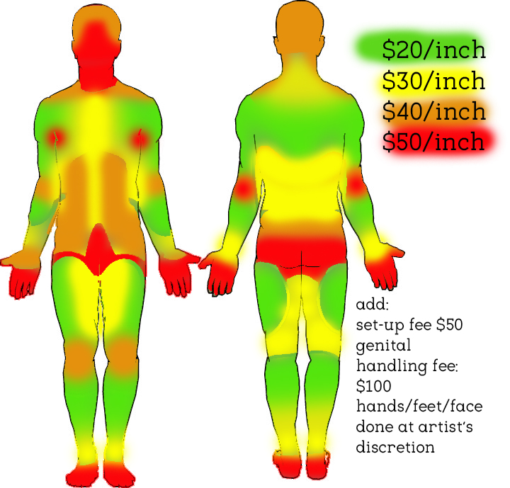
handy pricing chart used in some older studios.
If I were to make a chart about the actual pain? I’d simply put a blank body form and have people print it out and color it in.
Put red any place where you are sensitive to tickling or have any kind of weird feeling about being touched. Also any place that folds over, where the skin touches itself and is rarely exposed to air or touch.
Put blue on your genitals, hands, and face- AND on any area that has a previous injury, even a healed one.
Put yellow on any place that is often exposed to touch and friction, that has a lot of exposure to air and sun.
Put green everywhere else.
This is your personal, very own pain chart. Everyone will have a different one. Unlike the tattoo artist’s perspective, where all armpits are pretty much the same to work on, the perspective as a client will be totally individual and unique.
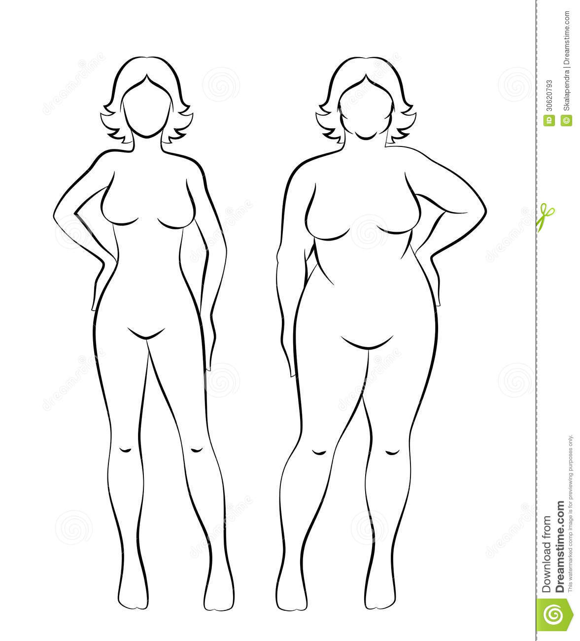
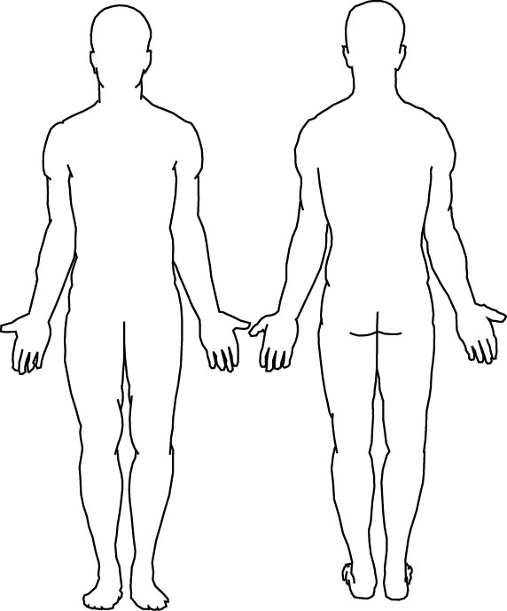
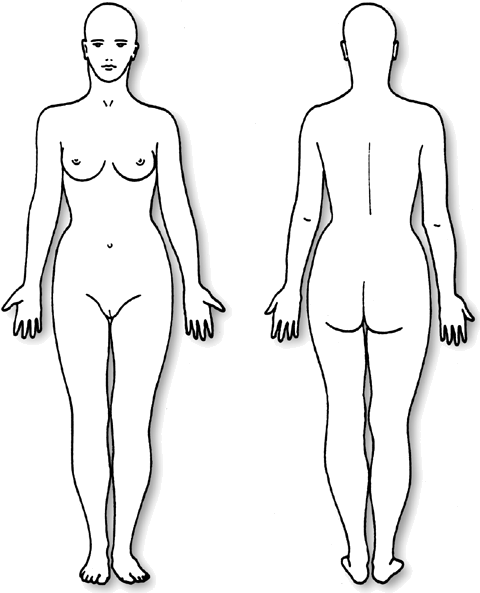
Here’s a few stock images you can color in.
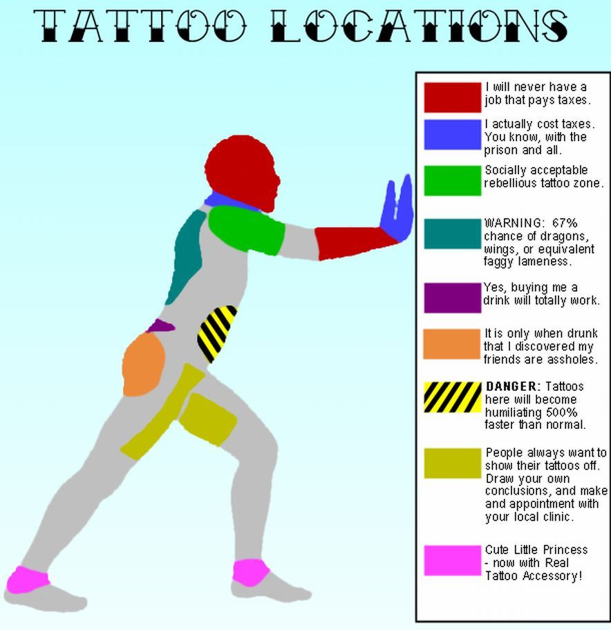
Oh yeah- you’ve probably seen this garbage floating around as well. It’s crap, and it’s demeaning to you guys who are my clients, and I hate this kind of shit. Strangely enough I don’t have too many clients who pay no taxes or go to prison. There’s some slut-shaming in there too. What a load of crap.
(for a great article about pain and tattooing in general, my friend Deb wrote a great one here)
(for a chart to figure out how much of yourself is tattooed, you can look at matt gone’s awesome post about this here.)