tattooing on darker, or uneven, skin tones
I’ve been tattooing for a long time and I’ve worked on every conceivable shade of human skin. I’ve noticed that the most important thing isn’t usually how dark or light someone is (although that matters when you discuss tonal value and contrast) but the hue of a person, the underlying warmth or coolness of their skin.
Skin color is created by melanin, a pigment found in the upper layer of the epidermis. Tattoos lie beneath this layer, in the area between the epidermis and dermis. This placement of the ink prevents it from being shed with dead cells, by the top layer, and by being dispersed into the capillaries, in the bottom layer.
Since the ink itself lies beneath the epidermal melanin, looking at a tattoo is like looking through a tinted window. Except for albinos, everyone on earth has melanin in this skin layer. Some will have a ruddy skin tone, some a cold tone to their skin. Some will be dark, some light. Some freckled, and some smoothly pigmented.
healed palette test
Taking all of this into account when designing a tattoo is important. Tattoo ink is not opaque, but translucent, so you see through one tinted window, then through the ink itself. More than one factor has to be taken into account to make a great tattoo on uneven or darker skin tones.
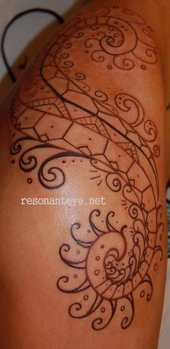
 Skin which is very dark, and has a cool tone, needs high-contrast, bold work to show up well. Colors which are light and warm (orange, yellow) will barely show at all after healing, while cool colors that are slightly more opaque (teal, turquoise, and black) will show up better. Working with a limited palette is a challenge but there are some amazing examples out there of work done this way. Large, shapely images with defined areas of negative space are particularly suited for this combination. Leaving plenty of negative/empty space, and making sure all edges are crisp and clean, works best.
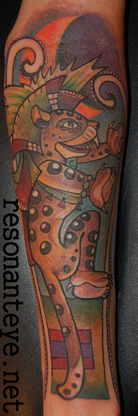
Someone with a warm skin tone, no matter how dark, can usually get the warm colors, red, orange, etc- more easily than the cold. Of course the darker the tinted window, the more contrast and open space you need, to carry the tattoo as a design and not a big muddle.
 No matter what skin tone you begin with, having the tattoo artist plan out the piece to allow breathing room almost always results in a better design.
When you’re tattooing ANY skin, you do have some limits- again, working through a tinted window, you’ve got to increase your contrast in the light/dark range to make a real impact. Super soft transitions in the grey just won’t carry across once the tattoo heals. You also have to take into careful account the tone of the skin, the color of the person, not just the dark to light range. For example, some very pale people are ruddy, red and their skin will not hold cold colors well. Freckles may show through and mar a design. Someone with cool, yellow skin like me will have a rough time holding violet. Being mixed race can change skin tone and texture a lot! Although yellow skin like mine can look white, it’s not. There’s a color tone to it that may make those purples look totally muddy. A warm orange, however, shows up great. really paying attention to not only the dark/light of a person’s skin, but the actual color of it, makes a huge difference and gives you way more options to draw on.
In short, you can do a lot with any skin tone or range of darkness. You just have to plan things, leave breathing room, and make sure your palette works for that individual person. The only universal rule for ‘darker skin’ is that the darker the tint, the higher the contrast you should use. Otherwise, adapt the palette to the person.
Oh yeah- white ink. White ink doesn’t even stay white on the whitest white person. It mutes, it looks like yellowy cream, on them. So, imagine a yellowy cream, being seen through that tinted window of the top layer of skin. I have done white-ink tattoos on a very, VERY dark friend of mine. After three sessions, we managed to get a design that looked a bit like rich coffee with a bit of cream in it, it actually stood out subtly and nicely against his darkness. But the design, again, was large, had a lot of negative space, and was designed to work even if the white just looked like scarring.
Every tattoo has its limits. Skin health and skin tone are just more variables we have to take into account when we design a tattoo.
the warm tones are diluted on cold skin tones, and vice versa. areas of low contrast are lost on darker skin tones. again- your skin is a tinted window, freckles are spots on the window. the art under it has to take that into account.
Tinted window. That’s the basic point.
to show you this effect:
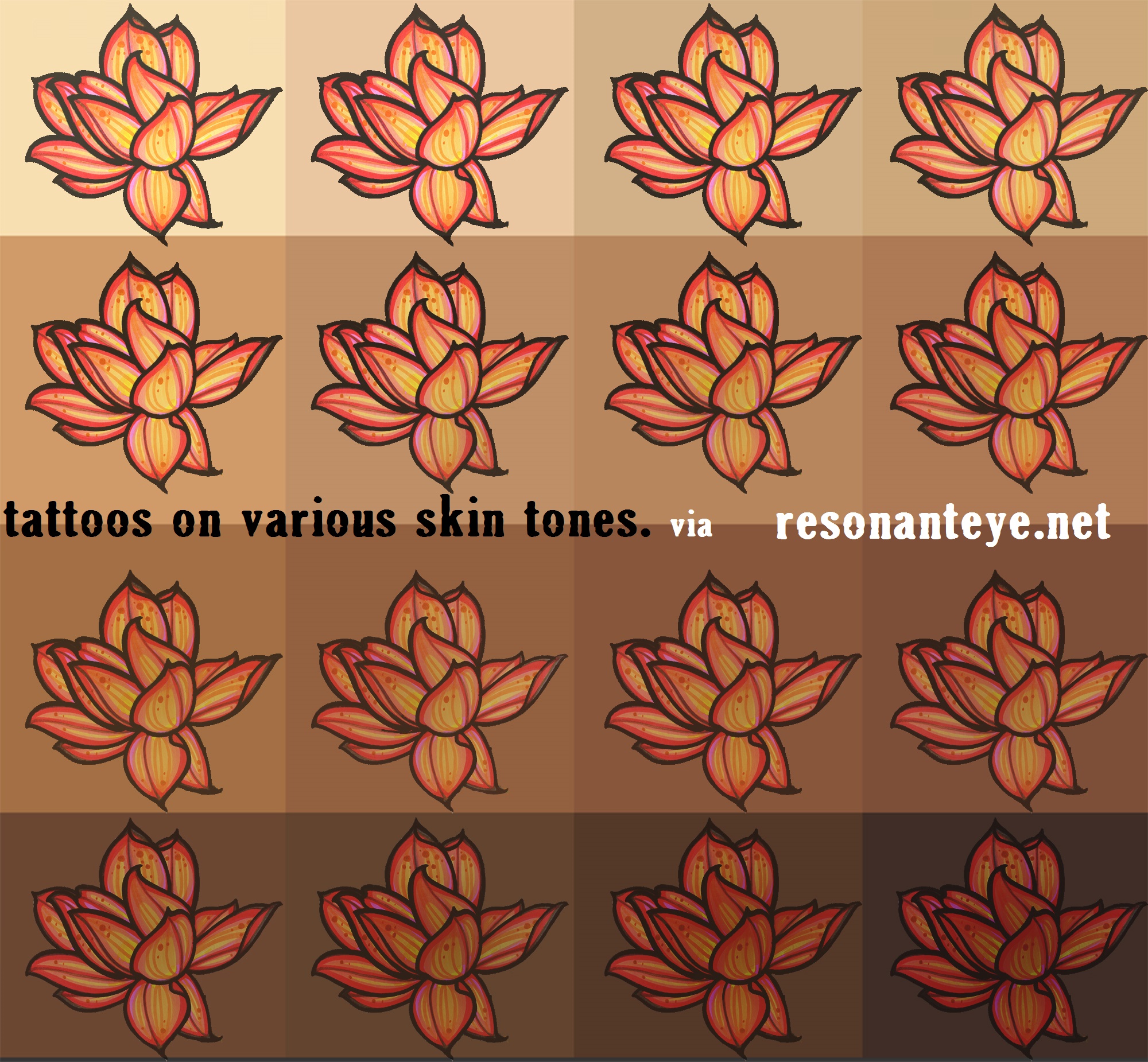
the color of your skin is determined by the top layer. tattoos sit underneath this layer: we actually look through the skin to see tattoos. our skin is a tinted window.
Also, here’s an awesome quick interview with a younger tattoo artist whose work I like.
Folks, get your MBA in business, and you’ll have an easier time tattooing (because you’ll know what the shit to do with the paperwork.)
edited to add:
I’ve heard some folks trying to say that any color will look fine on darker skin. THIS IS NOT TRUE. The simple mechanics of the process makes it impossible to get the same effect on lighter/darker skin tones. To explain the “tinted window” effect, here are two images.
Anyone saying there is no difference is incorrect, any images you see of what looks like yellow or pale, pastel color in dark skin is either photoshopped/fake, or freshly done and NOT HEALED. (Meaning some of the ink is trapped in the top layer, from which it will disappear during healing.)

tattoo pigment underneath the epidermis.
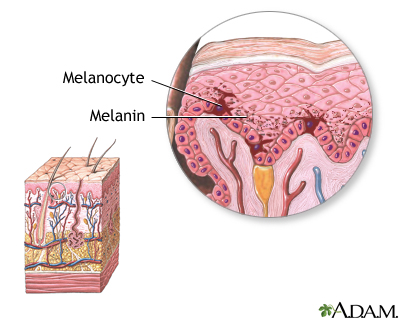
melanin IN the epidermis, ABOVE the tattoo ink.
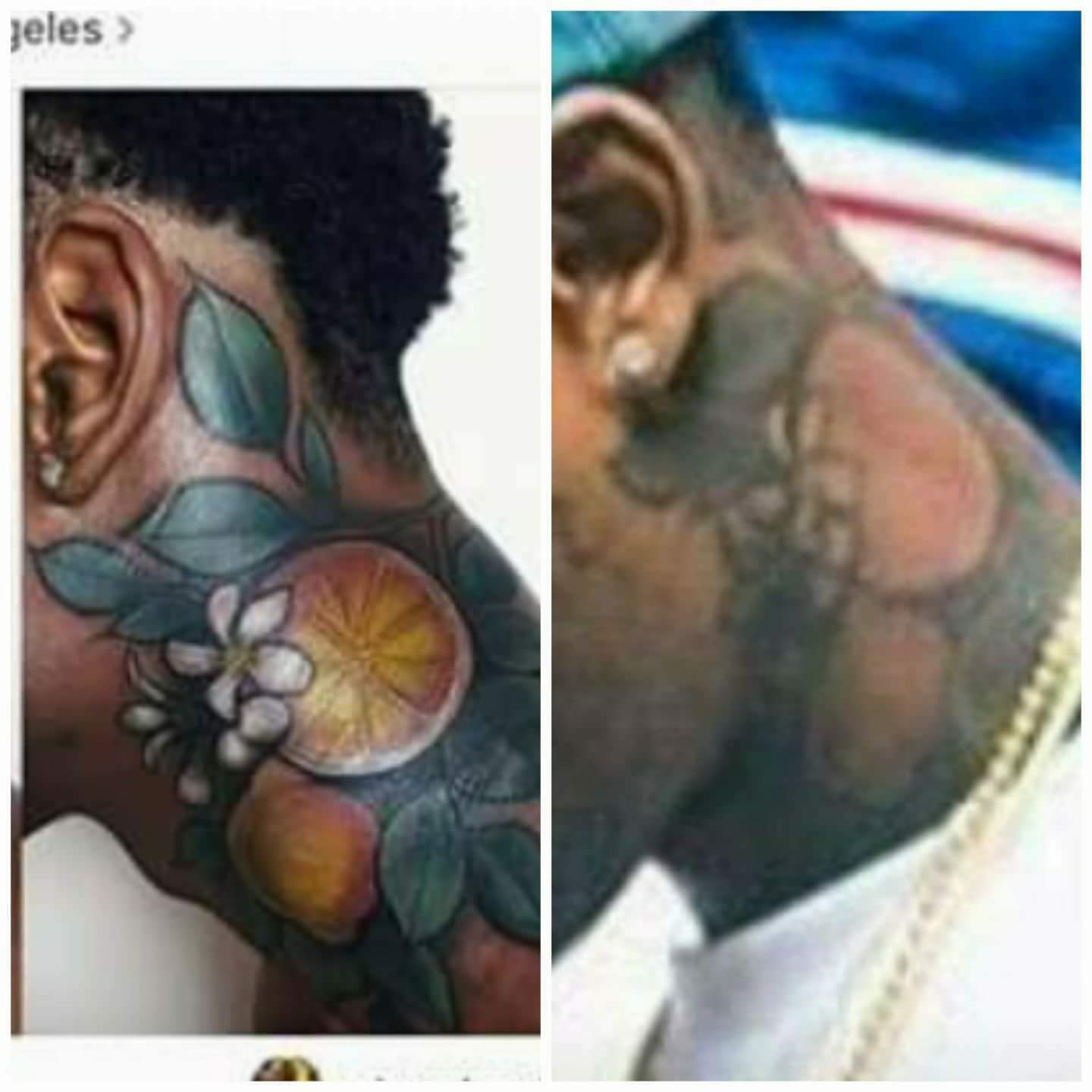
fresh next to healed. detail not done with high contrast is lost; warm undertone makes cool colors like green go dull and look darker.
detail in leaves and fruit are gone, white areas are slightly lighter than natural skin tone but not by much. I did NOT do this tattoo.
I’m attaching some photos of a tattoo I DID NOT DO, fresh and healed. in a fresh photo, the ink is above the skin layer that contains melanin. AS IT HEALS it will be BELOW that layer. a fresh tattoo on dark skin looks nothing like a healed one. fresh photographs are a way to get your money now, not a way to make you happy forever. it’s false advertising of what a tattoo will be.
Contrast is so so important. if you’re going to get tattooed with darker skin, please! look for HEALED PHOTOS in the artists’ portfolio! famous, unknown… doesn’t matter. a fresh photo looks one way. a healed tattoo six months later is a WHOLE OTHER THING. Any detail that doesn’t use high contrast, or uses colors opposite to the skin tone, will be gone by then.
your tattoo should be planned and executed to look good for a lifetime. you deserve that.
tattooers; if you have a healed photo of your work on darker skin, feel free to post up in the comments. it would be great to show people things that can be done!
ALSO:
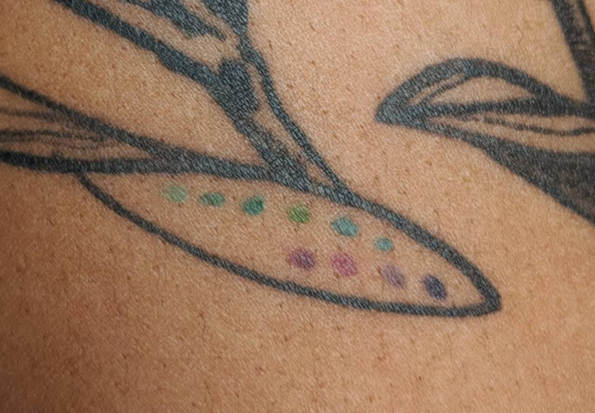
making a palette, or swatch test, for clients with darker or uneven skin tone. I always offer to do this for free as an extra service, when I tattoo someone with darker skin. when it heals, you’ll know which colors work best for you individually and you can use it as reference when you are deciding what to get done.
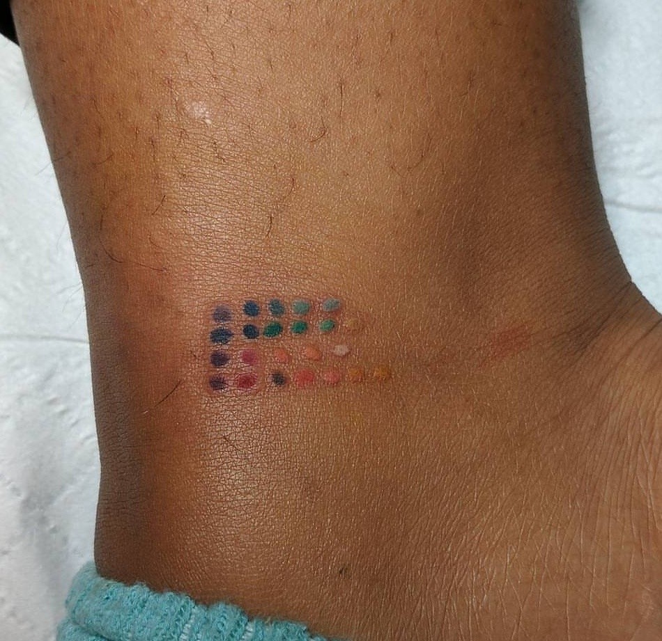
I’ll usually offer this whenever I tattoo anyone with a darker or warmer skin tone. if you want one just ask, it’s free for all PoC who I’m tattooing. it costs me nothing but time and a little extra ink and it’s worth it to me to give you good future knowledge about how color works with your complexion.
xox
