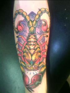
6 basic ways to improve your tattoo compositions.
 Every bit of information about art can be applied to tattooing- especially information about composition. Here are some basic ways to do this-
 Remember that in nature and in real life there are NO LINES. you are simply using linework to accentuate areas where there will not be enough contrast to hold up in skin over time. This means that you can feel free to use one-thickness lines OR sculpted lines, as your style and aesthetic sense dictates. When drawing an area of heavy black shadow, think about what the line there will accomplish- do you even need one? can you get a clean edge with a shading technique? Taking the time to think through your linework before you start tattooing can make a visible difference in the quality of your work.
2. When drawing the human figure, consider the bigger shapes first.
The masses of the head, chest and pelvis are unchanging. Whatever their surface form or markings, they are simple shapes.
The conception of the figure must begin with the thought of these blocks in their relation to each other. They are to be thought of first as one thinks of the body of a wasp, with only one line connecting them, or without reference at all to connecting
portions. The pelvis is a real thing, legs do not begin at the end of the ribs, and asses always have hips outside or above them.
When you draw that sailor girl, remember that the big shapes of the torso, head, and pelvis can be drawn first, before you make any detail. This actually holds true for almost all drawing- if you sketch the outside perimeter or general shape of the design, then mark proportions, then begin adding detail, you will have an easier time getting your composition to flow nicely.
3. Consider the shape of the surrounding “frame”.
 When you mark out a foreground, think of it as one big shape. This shape should fit well into the area of the body the tattoo goes onto- for example, a tall sleeve on a long arm. A horizontal shape across a chest. Use the outer edges of the muscle in the area as your “frame”.
For example, a forearm (inner) is an eggy oval, and should not be treated the same as a horizontal rectangle of paper.
4. Apply basic compositional principles to that area.
The very basics can be found online, and I’m writing another post about this. It’s a lot of information to take in- in fact, here is an entire set of classes online just about these basic rules: http://edsitement.neh.gov/curriculum-unit/composition-painting-everything-its-right-place
Here’s another link with some simple explanations of the basics.
http://www.creativebloq.com/digital-art/tips-composition-31514496
5. Use different types of contrast to move the eye through the tattoo art.
 Don’t muddy things up with detail on every square inch. Or with uniform layers of black as shadows throughout.
Contrast should not only be contrast between dark and light (value contrast) but between size of constituent shapes, bright and subdued color, cool and warm colors, and precise and blurred detail.
When you use more than one pattern in a tattoo, like, say, snake scales in the foreground and clouds in the background, make sure that the scales and the cloud shapes aren’t all the same size. Also, make sure they’re not all the same general shape- contrast one area, with rounded forms in the pattern, with another area that has sharp edges or square shapes within the pattern.
An artist I admire calls this the potato effect.
6. Understand how the design will shift when the body moves, and how the canvas-skin area will change over time.
Ribs/waist bad, forearms/calves good. Areas that have elasticity will change when the person gains or loses weight. Some areas wrinkle more than others and some parts of the body will distort the design when moved. Be mindful of placement, and how the areas of the body relate to each other.
