basic lettering for tattoos, script
 I do not know enough about lettering to call myself any kind of expert.
seriously. (check out some of my art with lettering in it for verification of that)
I am sometimes shaky, I am often confused by fonts, and although I have done thousands of tattoos with text in them, I still struggle with the forms and shapes. I owe the little I DO know about lettering to B.J. Betts, who is well-known in tattooing as a real expert on this stuff- he has some books out, if you are a professional tattoo artist you should keep your eyes peeled for them and buy them. (but if you work in a shop or have been around a while you already own all his stuff…)
I learned to do lettering before I ever heard of his work- the way I learned was through calligraphy, and through sign painting. A combination of those things and Betts’s work has formed my meager abilities.
Here’s a walk through on drawing this stuff. If you’re a tattooer you will naturally make the proper adjustments to the text as you go in order to make it applicable to skin, so I won’t be explaining the precise tech needed for that. If you just want to add a tattoo to a painting, a drawing, if you are not a tattoo artist you can use this how-to to make script lettering … or if you are doodling reference for your tattoo artist to build you a tattoo from, you can do this to give them an idea of what you’re after.
This is a step-by-step for script, cursive lettering in a slanted style in which the letters are connected.
I will post a separate one for block or stylized lettering next.
My tools:
fountain pen
(with round nib- just what I prefer)
colored pencil
(for beginning sketch/marking symmetry)
standard black #2 pencil
tracing paper, paper that is easy for ink lines
(I am using a scrap of srches hotpress here)
The rest of the steps, after the jump.
first step-
draw three or four parallel lines.
if you want a curved word, make parallel curves like in this picture.
I am envisioning putting this lettering onto maybe an arm or something, so I want a nice uplifted curve. I draw four lines because I am anal about this part but three is fine.
it will be the bottom, top, and the center/lowercase top of your letters. to make “feminine” letters, center it further to the bottom. for more loopy ones, nearer the top.
my additional top line is for dotting i’s and crossing t’s and other embellishments.
if, like me, you aren’t using a french curve or draughtsman’s curve to make the lines, fold it in half to check that your arch is symmetrical.
Then you can also use that center fold as your vertical mark-
a line to show you where your lettering is centered.
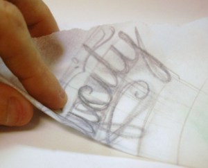
Then, put tracing paper on top of your curves.
This top layer is where you can begin your sketch.
You’ll be using the lines you drew as a guideline throughout so take a minute and make sure they are nice and even, symmetrical, and centered properly.
now you need a base font to look at for reference.
I have a million saved in my laptop, and just open wordpad and type in the word, then screw around looking at them until I find one I like for the piece I am doing. Remember, this is for visual reference- there will be no tracing from it, so you do not need a printer.
Find the visual center of the word- the word I am using is ten letters long, so just after the fifth letter is the center, technically. but eyeing it and holding up a pencil to measure- the letters in the second half, ths “i”‘s and the “t” are narrower than the “m” and “p” in the first half. So I want to move my center a little off towards the left side.
at this point we start to see the word as a drawing, an object to be represented rather than a series of letters.
 now I look at my reference, then draw it.
I’m not aiming for perfection at this point, just an overall shape that pleases my eye.
sketch out the word as one object- follow the guidelines when drawing the top and bottom of letters. try to get the top of lower-case letters to fall on that center line along with using the top for any little extras. I did not use an extending line to line up the bottom of the swoopy letters (the “p” and “y”) but you could if you wanted to.
At this point you’re just getting the roughest sketch down.
Notice that I have also got my little notes about where the middle of the word is visually on that paper too. along with having marked out a vertical center line. (just before the “l”)
do this sketching, if you are me, about a hundred times, while cursing and crumpling pieces of paper.
 next flip the paper over and take a look-
is this a pleasing shape? as an abstract lined shape, does it look nice?
mine does not. so I am making rays- lines which radiate from a center well below the lettering- as guidelines for the letters to follow. I don’t like the slant I’ve made on the letters so I am going to alter it more to make the letters ray-like.
You do not have to do this, though. just eyeball it as if it was some kind of weird design, and if it looks wrong draw a fix for the wrongness on the backside of the paper.
then flip it back over and use that to repair what you saw wrong with it.
remember- we’re not writing a word, we are drawing a design.
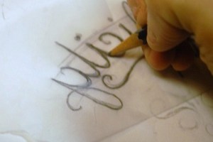
 getting serious now-a real pencil.
you can see how I am slowly shifting the slant of the letters to align with my framework sketch. at this point I kind of know how each letter fits into the whole-
I have moved a few to make the spacing more even. I have changed the shape of the curves a bit to make it look more curlique.
I’m a step or two away from inking it
on paper or skin.
note: that vertical center line is still the most important thing in the piece, for me.
check to see if it is centered properly- if the first and last letter line up.
check your guidelines- do the arches align?
check the framework of the rays (if you used those)
do they line up ok? do the slants on the letters line up enough to balance the whole thing out?
If you’re adding swoops and swirls, is the outlying edge of those either symmetrical, or at least balanced?
I also like to make sure my letterforms are all a similiar size. it’s easy to start too big and end up smaller…or vice versa. the first few and last few letters should all look even.
double check the flow and the look of it as just a design, not a word.
nice? cool.
then trace it with your standard awesome black no. 2 pencil.
lay that graphite on it.
this is what’s going to make your transfer for your final drawing of the piece.
notice I haven’t added dots or crossed my “t” or any of that. just the letters.
I am however tracing through that weird swirly at the bottom for some reason known only to my subconscious.
 now take this scrap of abused tracing paper and leave the room momentarily with it.
find someone who is not a tattoo artist. show them the scrap and ask them “WHAT DOES THIS SAY”
If you are alone take a picture with your phone and post it online asking the same questions. (instagram jerks- DO NOT USE A FUCKING FILTER. this is a legibility check, not olan mills. fuck sake.)
once you get someone to tell you what it says, look at it again.
what’s wrong with it? in mine, the “c” looked like an “e” and the “y” looks like it has a “c” in it. so I will fix that in the next step.
double check your spelling at this point too. seriously.
“Simplicity is the state or quality of being simple. It usually relates to the burden which a thing puts on someone trying to explain or understand it. “
DO NOT JUST USE SPELLCHECK. Go online, type it the hell in, read the definition. make sure the words you are using mean what you’re trying to say. double check things like “to” vs. “too”, and your use of apostrophes (if any).
Then trace out the word. Lay it on your final piece of paper and trace over the whole thing- the pencil on the back will transfer over.
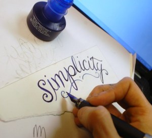
 now I like liquid acrylic inks, but you could use a regular pen, a pencil, anything.
finish out the letters- double up vertical lines, to make a nice calligraphied feeling to it. fix any little errors you notice at the last minute- make things nice.
at this point you can call it done.
I use a round-nibbed fountain pen. The guts of the pen no longer work at all but I dip in and tap, I like the nib on this thing so much, it’s a bit worn in which makes it perfect…
I like to use the round nib but if you are actually wanting to know about real calligraphy pens I am probably not the best source, seeing as I am a tattoo artist and not a calligrapher-
I have seen some beautiful stuff done with the different nibs and pens and things though.
 the font I used for my original reference-
it has changed a lot, simply because I only looked at it once, at the start,
to get the basic shapes fixed in my mind.
I prefer not to trace out lettering. I like the tiny inconsistencies that come with drawing it by hand. I like the way it looks.
of course you could trace it. if you wanted to.
at this point the lettering itself is done.
I don’t add any extra crap, or I try not to- up til now.
Until now we have been trying to make a visually appealing word that someone can still read and understand, so adding stuff…swirls and loops and bling blings and shazzams…that’s kind of not been the point.
And I know, I know. the fun part of this shit is making all kinds of hootenanny bullshit all around it so it is fancy and shit.
so ok, fine. Your lettering is done- now go ahead and fuck it up with some pinstriped squalor.
 that’s the basics- for really precise lettering you’ll want to trace letters.
for more handmade look, draw from reference.
for non-tattoo artists, there’s a lot of really good reference available on calligraphy, font design, and the like.
for professional tattooers, if you don’t have BJ’s books, (SHAME ON YOU) email me for a link to the supplier that sells them.
and if this post helped you, buy me a cup of coffee! or comment below if you’re broke!


